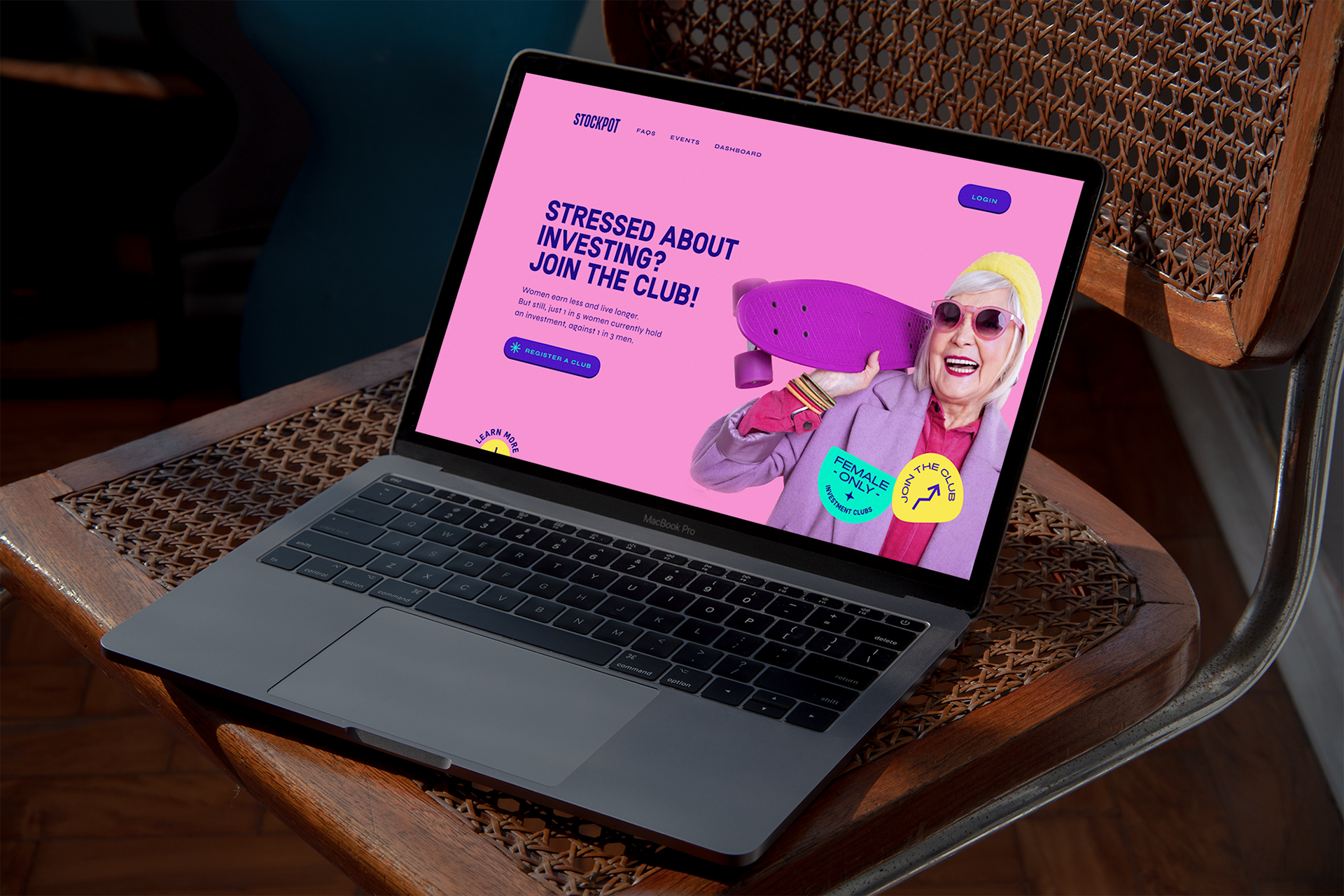

Stockpot | Brand Identity
Stockpot exists to break down the Gender Wealth gap and empower women to set up and run successful investment clubs. Fare Studio came to me with a defined look and feel for StockPot, needing some small tweaks to their logo and a set of bold, confident typographic sticker devices. We leaned into a 90s style and colour palette (an ode to the investment clubs that were popular in the 1990s) to give Stockpot a feminine, daring feel full of confidence and vibrance.